My Role
UI/UX Designer
Timeline
10 Weeks
Tools Used
Figma, Miro,
Adobe Suite
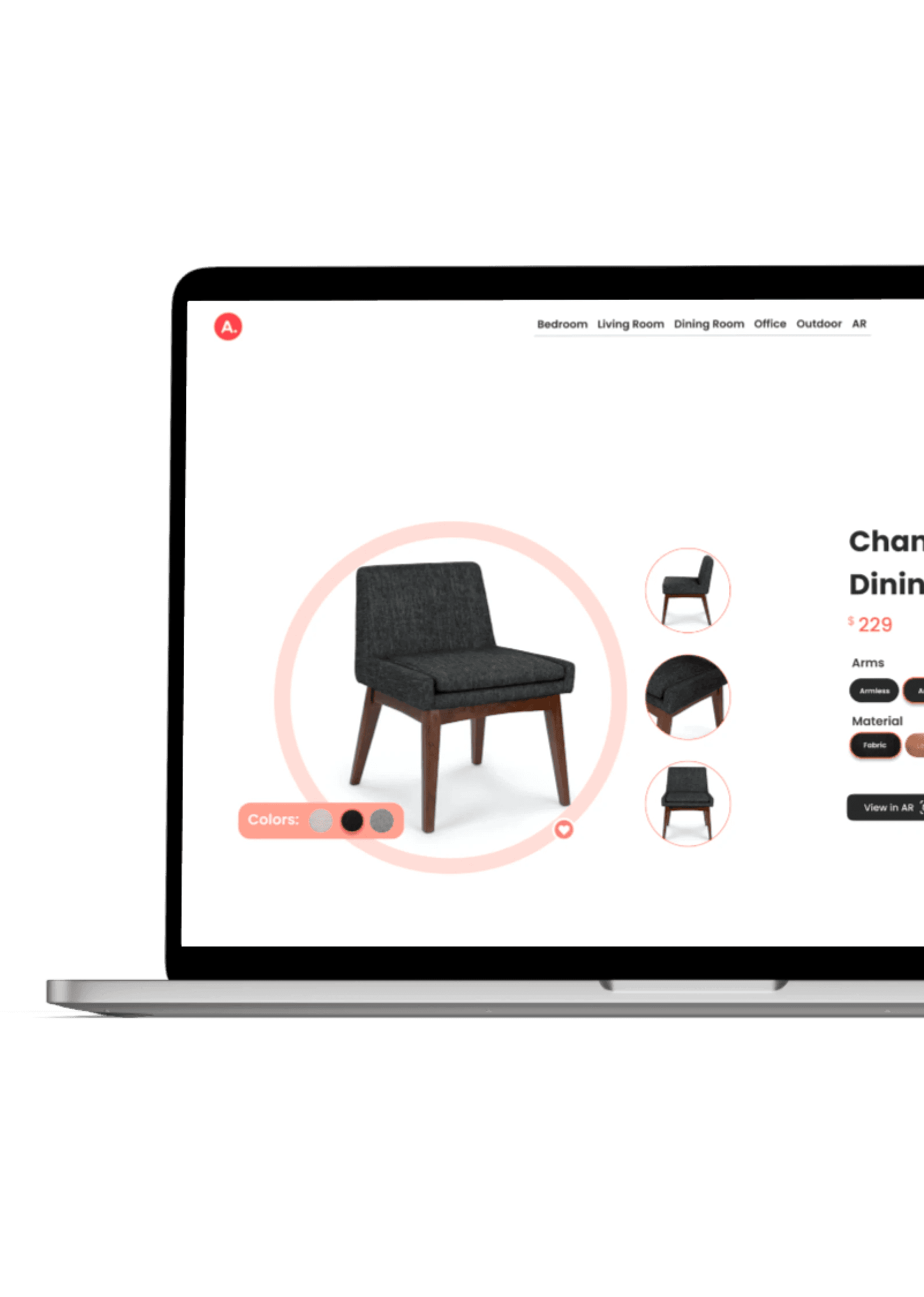
Problem
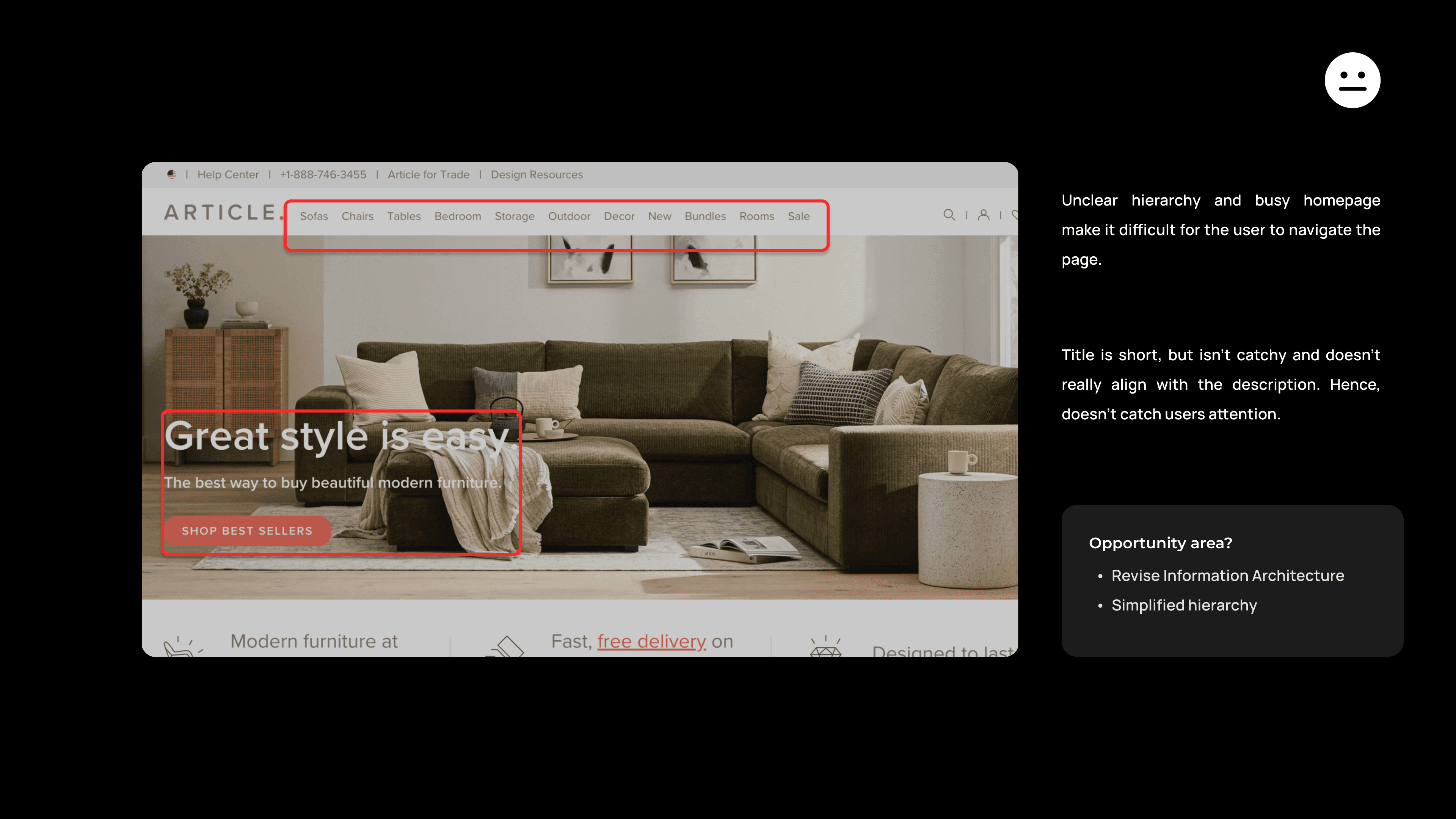
The website has a cluttered homepage and unclear hierarchy, making navigation difficult.
• The global navigation is both redundant and confusing, with overly extensive labels that need better grouping.
• Repetitive elements and labels further contribute to user confusion.
Goals
Enhance label clarity, simplify crucial information, improve UI design, and create a more user-friendly website experience to minimize ambiguity and enhance user understanding.
First Impression Evaluation
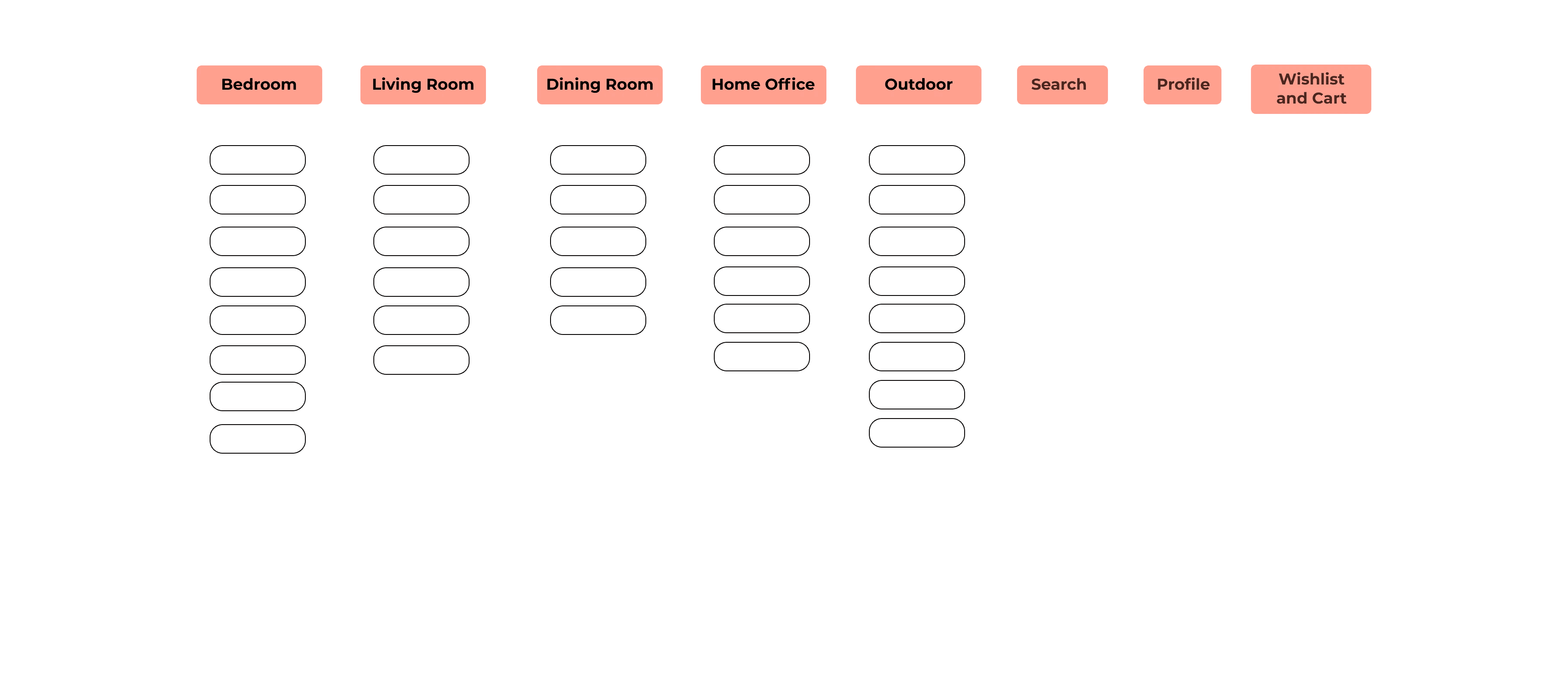
I refined the structure of Article's information architecture through a card sorting exercise involving users of varying age groups, aiming to improve navigation and enhance overall user experience by making it more intuitive and accessible.
Current

Revised
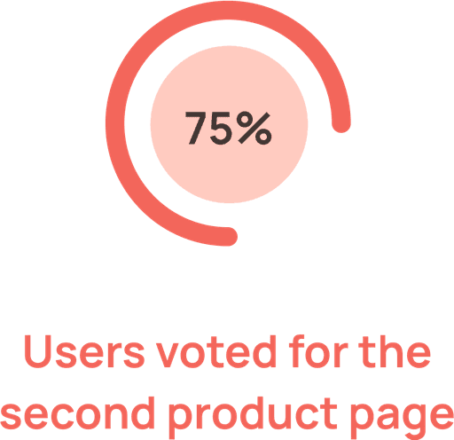
Exceptional user experiences can drive conversion rates surpassing 90%, resulting in increased user engagement and profitability.
Wireframing
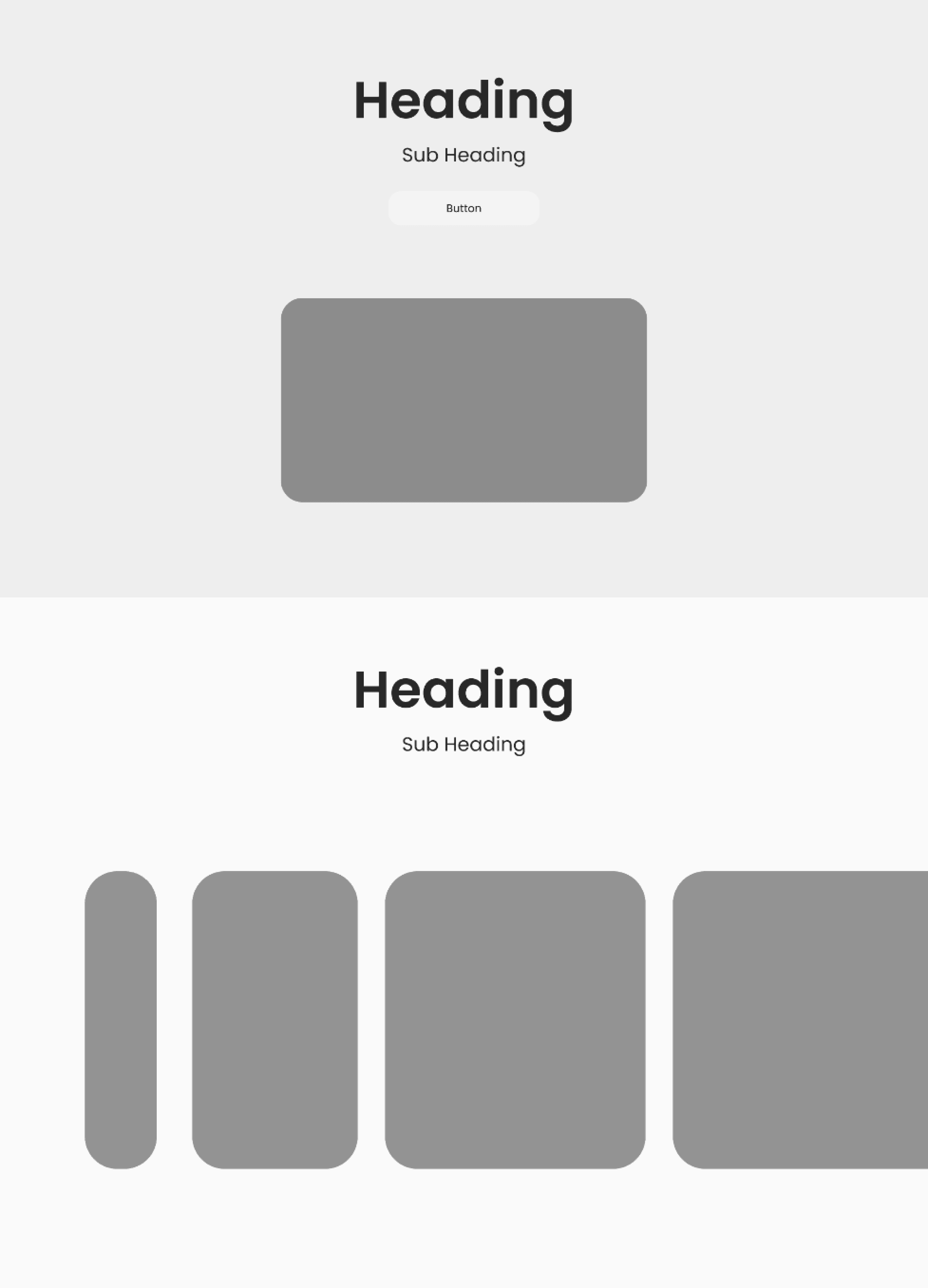
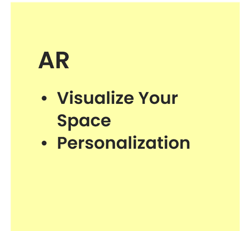
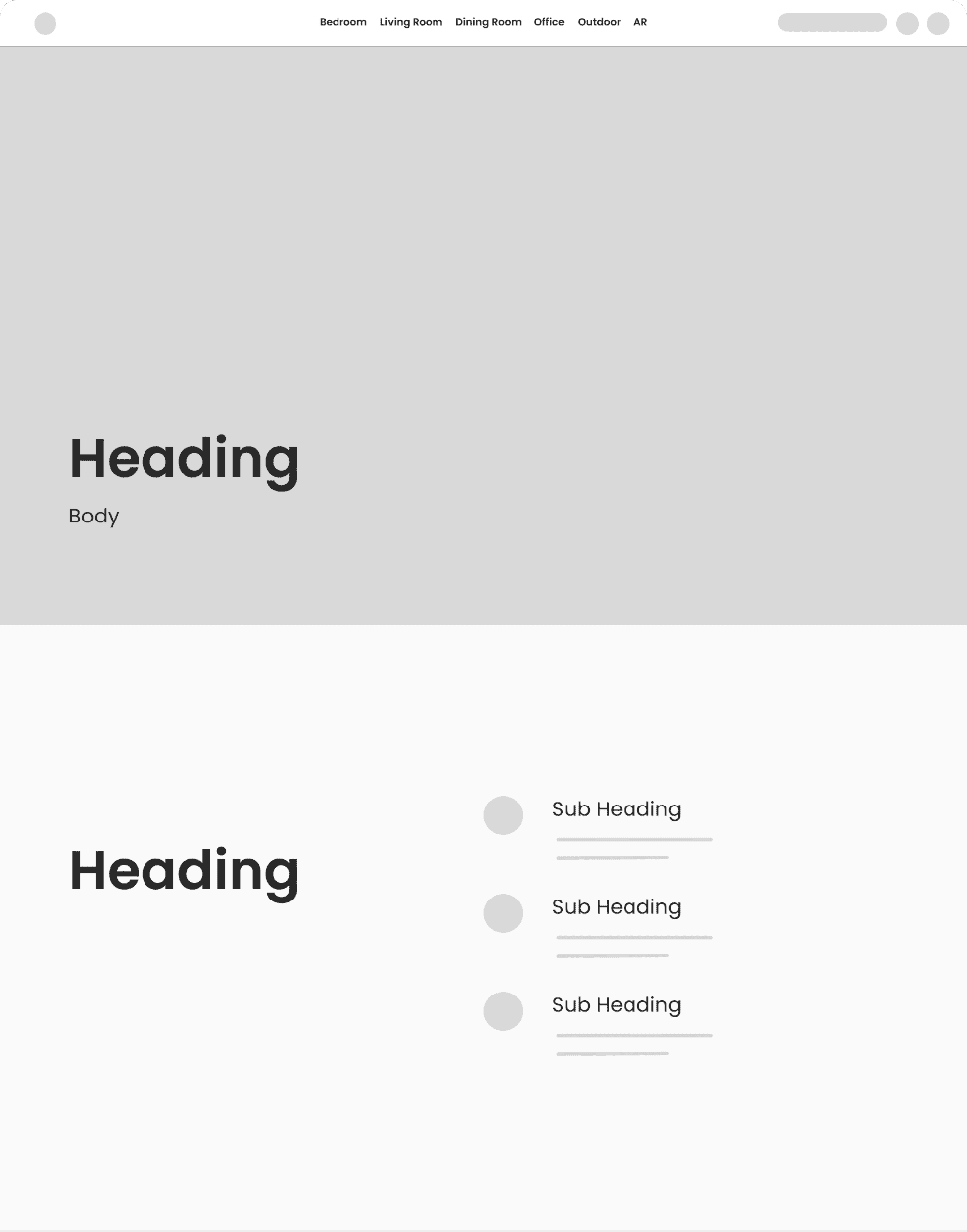
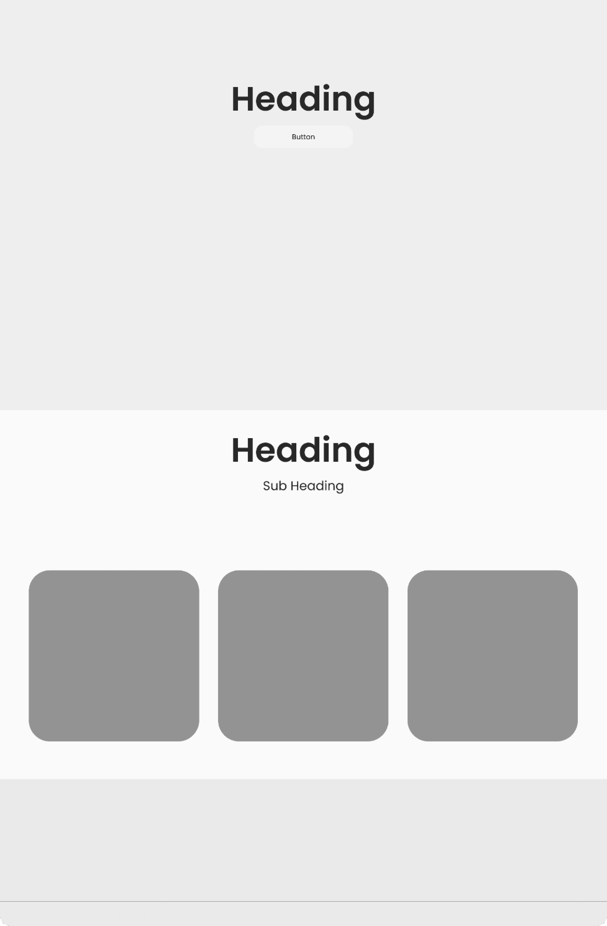
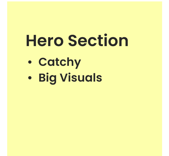
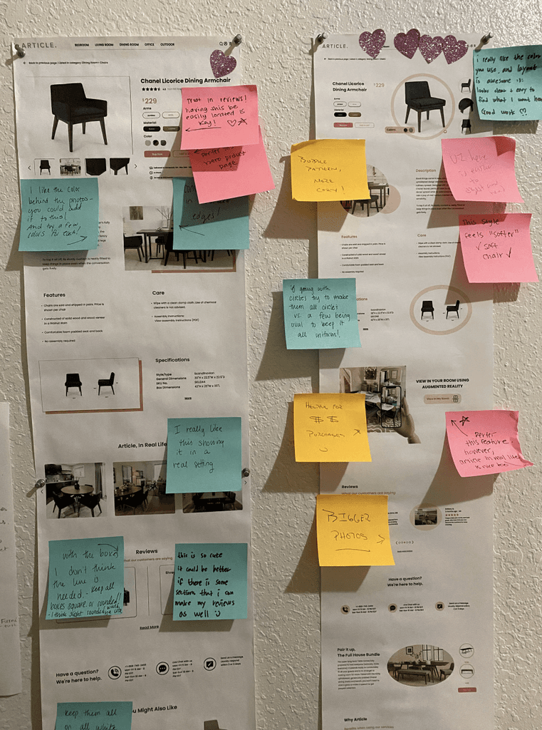
I created wireframes outlining the layout and features of both the homepage and product page of Article, detailing various sections and functionalities.





UI Design
Lead to:
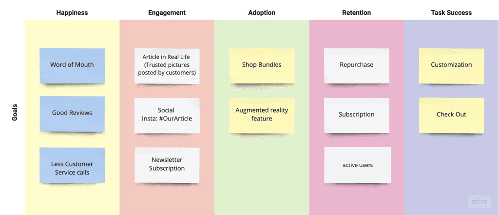
- More Active Users
- More Sales
- Increased Conversion Rates
Learnings
Identified user preferences through feedback and data analysis to tailor the website design accordingly.
Improved navigation structure and user flow to optimize ease of use and accessibility.
Implemented strategies to enhance conversion rates by refining the checkout process and optimizing call-to-action placements.
What could I have done different?
Better onboarding process.
Conduct more user testing.
Explore opportunities to implement more personalized recommendations and content based on user behavior and preferences to further enhance engagement and conversion rates.
Let's Connect!
Back